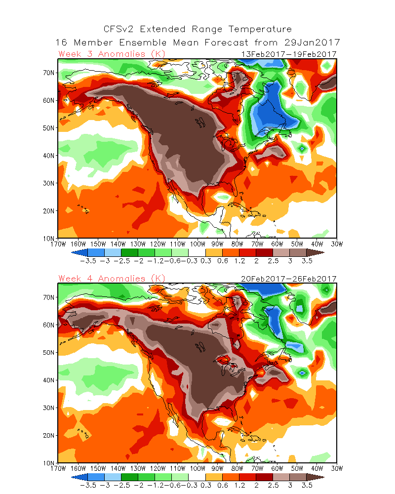
There are several long-range forecast models, and none of them are particularly accurate. However, last year’s CFS weekly climate model, for better or for worse, nailed the forecast at this juncture four weeks before the race (our first disconcerting post was on Feb 2 but the models showed sustained warmth on Jan 29). So we’re four weeks out from the race (actually a bit less) and the models look one whole heck of a lot better. At this lead time a year ago, here’s what the models looked like:
[Weather nerd trigger warning: these maps are from 2017]
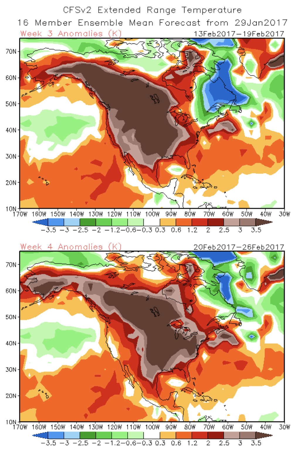
That brown was not good at all. The Birkie was in the middle of a continent-wide high temperature anomaly which would up with temperatures in the 50s for several days, melting down the Birkie’s base and scuttling the race (yeah, I know we all remember that too well). And it would only get worse.
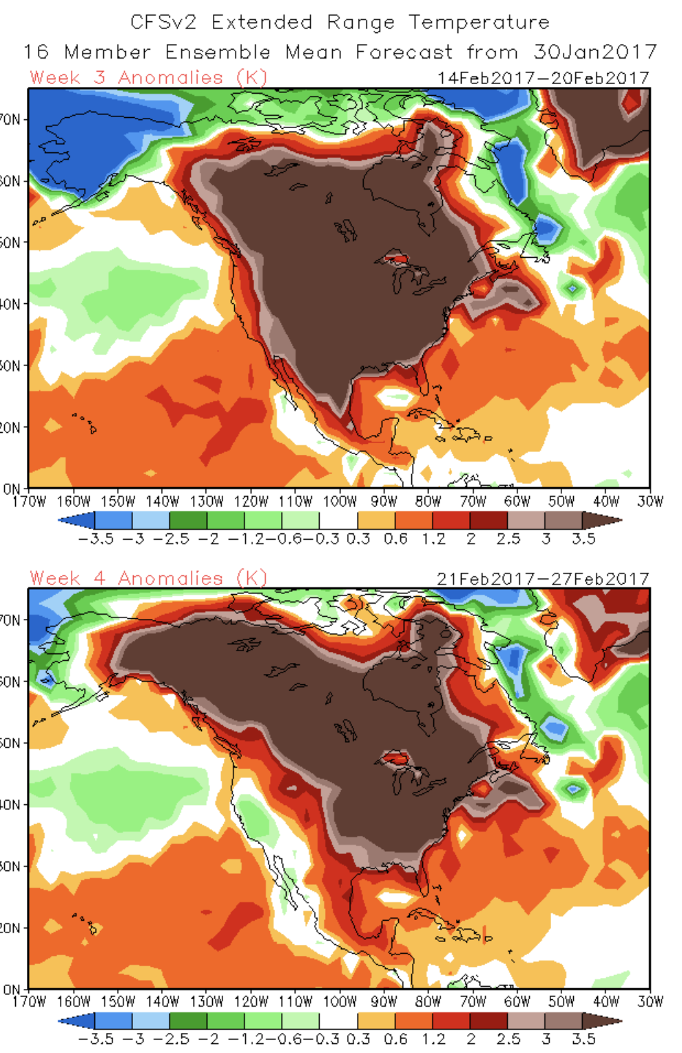
This year? It’s better. The ugly browns are mostly gone from the eastern two-thirds of the country, with greens and blues in their place. Greens and blues are colder than normal, and colder than normal doesn’t melt snow.
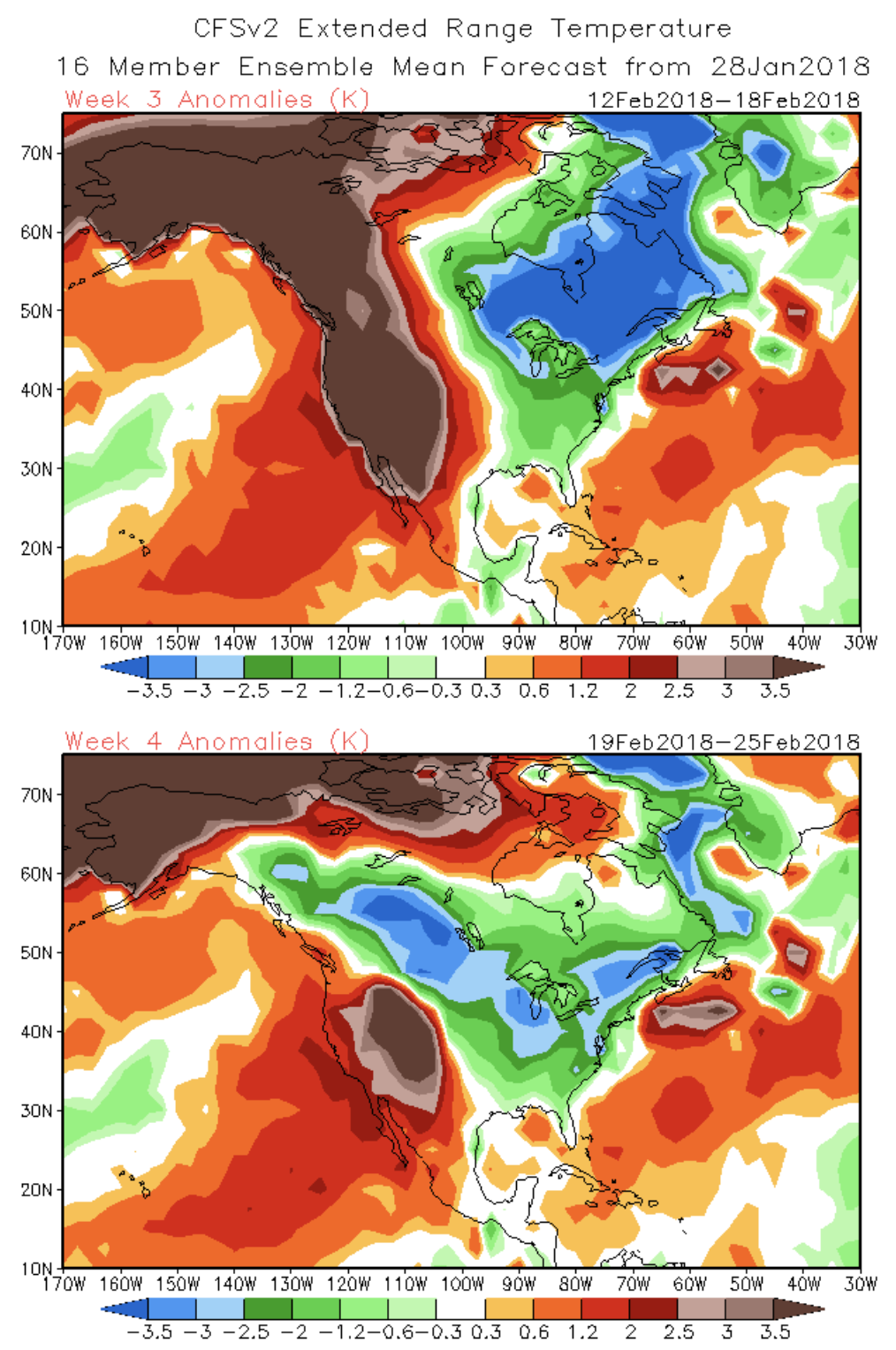
Now it’s not all perfect. The base is rather thin and there doesn’t seem to be any big snow on the horizon. I’d feel much better looking at these maps if the ridge (warmth) out west was muted a bit—that can slide around—and if there was a foot more snow on the ground. But where we are sitting right now looks a whole heck of a lot better than last year. Things can, and will, change, but if the next week holds serve, we will probably won’t be talking cancelation.