I’ve always wondered: how does the weather of previous years affect the participation in ski races? My hypothesis was that several good snow years in a row—2008-2011—was cause for the rise in Birkie registrations. As it turned out, a couple years ago I downloaded all of the data for the history of the Twin Cities’ climate record. Over 100 years of snowfall and snow depth (with 1913 missing). I’d blogged some about this back in the day, and decided to revisit the data.
We also have history of race day weather posted in the Guide.
So, I have a chart of snow depth in the Twin Cities since 1900:
 You might want to click this to enlarge it. A couple of notes: each bar shows the number of days with at least that many inches of snow on the ground. The cutoff for at least decent skiing—I’m putting it at 3″—is light blue; two and one inches are shown as light gray and white. And the asterisks show disruptions to the Birkie:
- a single * denotes a slightly shortened race, when lake issues precluded a full 50k race.
- Two ** indicate a race which was significantly shortened—to about 25k.
- Three *** show the 1981 race, which was canceled and then re-held two weeks later
- Four **** show the 2000 race, canceled and not rescheduled.
The best snow years were 1979 and 1982, with more than four months of good skiing in the Cities, although 1981 was less-than-stellar. The worst: 1944 had a single day with three inches of snow on the ground, making 2012 look like good year by comparison. Still, there have been several years with considerably more skiing than this one, but where the Birkie was cut short. It really was a bit of magic that it was held this year.
And the four preceding years, 2007-8 to 2010-1 inclusive? All were better than any year since 2001, which itself was the only good snow year in the ten years from 1998 to 2007. So, we can be thankful for that.
But how does the weather affect participation? It seems that when the race is interrupted frequently, it adversely affects the race for years to come.

Participation in the Birkie climbed quickly from a few dozen in 1973 to several thousand by 1981, helped by both the fitness boom and several good snow years in a row. The 1981 race postponement (and poor winter) put the damper on growth for a year, but a good winter in 1982 put the trajectory skywards once more. Three shortened races in a row, however, cut short that growth, and the size of the race stagnated through the early 1990s. It didn’t start growing again until the middle of the decade.
Once the race had begun to grow again it reached a record size in 1997, only to be hit by three interruptions—a halving, a cancellation and a shortening—in the next five years. It has grown since, and in the last ten years there has been only one race interruption, and some very good conditions otherwise. It seems that one good year doesn’t arrest a trend of bad years (i.e. 2001) but one bad year shouldn’t keep skiers too far away. Nordic memories, in other words, last somewhere between 12 and 24 months. Also, it seems that the size of the race is dependent both on recent snowfall, but also recent race experiences—a good Birkie can make up for dismal snowfall, but good snow can’t necessarily make up for a not-quite-perfect Birkie.

This is a chart showing the snowfall for the previous five seasons (inclusive) for each year, and there seems to be some weak correlation between race participants and snowfall, especially since the early 80s (good snowfall, not so good Birkies). Notably, the mid-2000s were dreadful for snow, equalling the worst single year in the early 1990s and, before then, the early 1960s but lasting nearly a decade. The blue dots show the annual “good skiing” days for each year, unaveraged.
Finally, here’s a chart showing snowfall for each year, split in to pre-March and post-March categories. Obviously this doesn’t account for the exact date of the Birkie each year, but it gives a decent sense of those years where snowfall totals were inflated by a freak April blizzard.

Want more? Here’s the number of skiable days compared with the amount of snow: the gray bars show yearly snowfall, the blue line skiable days per inch. The higher the blue line, the better “performing” winter. Note that with only five skiable days, the previous winter, 2011-2012, is the worst-performing winter in the history of the Birkie (in Minneapolis). Although, in Birkieland, where there has been not-too-much snow and a couple months of good skiing, it was probably a better-performing winter (alas, we don’t have decades of data for Hayward). With global climate change, we can expect both snowfall to decrease and the skiable days per inch to fall as well, as what snow falls will be more likely to melt. We can see that on the chart below, although note that it is quite arbitrary to start in 1973; if we ran the whole of the data the lines might be much flatter.

Want more? Here’s a
very cool site and a very cool
chart from it: yearly charts from all the way back to the 1800s.
How does this all correlate with ski conditions? Well, by combing Skinnyski reports back to
2002, we can chart out when there was skiing, and how good it was. (I explored this a few years ago in
further depth with broken image links.) The colors here are: light blue = fair or poor ski conditions, and dark blue = good or excellent. The green, yellow and red show three big races (the Loppet, Mora and Birkie) and whether they took place. Click to enlarge.
N.B. that these data are for trails in the Twin Cities area; we’re going to work to see if we can do this for other regions, too. This is all reported conditions, but there are enough data it should paint a pretty good picture.

 You might want to click this to enlarge it. A couple of notes: each bar shows the number of days with at least that many inches of snow on the ground. The cutoff for at least decent skiing—I’m putting it at 3″—is light blue; two and one inches are shown as light gray and white. And the asterisks show disruptions to the Birkie:
 Participation in the Birkie climbed quickly from a few dozen in 1973 to several thousand by 1981, helped by both the fitness boom and several good snow years in a row. The 1981 race postponement (and poor winter) put the damper on growth for a year, but a good winter in 1982 put the trajectory skywards once more. Three shortened races in a row, however, cut short that growth, and the size of the race stagnated through the early 1990s. It didn’t start growing again until the middle of the decade.
 This is a chart showing the snowfall for the previous five seasons (inclusive) for each year, and there seems to be some weak correlation between race participants and snowfall, especially since the early 80s (good snowfall, not so good Birkies). Notably, the mid-2000s were dreadful for snow, equalling the worst single year in the early 1990s and, before then, the early 1960s but lasting nearly a decade. The blue dots show the annual “good skiing” days for each year, unaveraged.
 Want more? Here’s a very cool site and a very cool chart from it: yearly charts from all the way back to the 1800s.
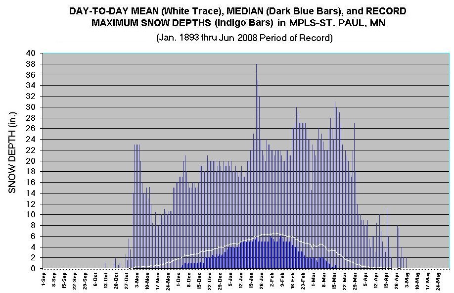
