A much longer race

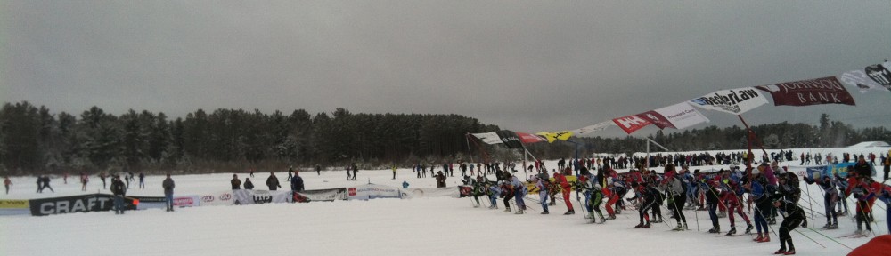
Everyone said that the Birkie was hard. It took a longer. A whole, lot longer. The chart below shows finishing times for the past five Birkies, for the skate race (other divisions coming; my computer went on the fritz and had to be repaired so I’m a bit behind). A couple of things to notice. First, the 2014 race was so, so much longer, on average, than the previous races. 2013—which was a slow year—shows longer times, but only slightly. 2014 is pretty much off the charts. Second, the finishing times are much more spread out. In the previous years, the peak 5 minute finishing time had at least 160 finishers. In 2014, it didn’t even make it to 120. So it’s a much flatter curve. Some more statistics below …

Want more? Here are some statistical statistics for the past five years.


2014 2013 2012 2011 2010
Total skiers 3773 3951 3743 3699 3641
Average time 4:48:47 4:02:51 3:46:40 3:46:19 3:30:36
Median 4:44:23 3:54:03 3:36:20 3:35:05 3:21:04
Stdev 1:10:24 0:59:08 0:59:20 1:01:33 0:52:52

That’s impressive. The average skier finished this year in a hair under five hours. Last year, a slow year, the average skier just barely topped four. And compared with the fastest year in 2010 (quite possibly the fastest on record; the winning time was), the average times are nearly 40% longer. In other words, if an average skier skied at the same pace in 2010 for the amount of time they skied this year, they could turn around in Hayward and make it back to the Gravel Pit at 31k. So if it felt like skiing a 70k race, it’s because it pretty much was.

More analysis coming soon; for now I’m off to ski.

The data are coming!

Well, the data are here. Sadly, my computer’s trackpad decided to go on the fritz, so it’s in the shop until tomorrow. Of course, I may be off chasing Aurora all night, so that could be moot. In any case, tomorrow is a new day, and perhaps one where we’ll get some charts up. We’ll be tracking how much longer the race took everyone this year, how many people missed their starts, and other sundry data. Stay tuned.

Anyone good at coding/data visualization?

So, I need some help. I have some really fun data. It shows, for every minute during the Birkie, how many skiers were at each quarter kilometer of the course. The example above, for instance, shows the state of the race—the actual position of skiers on the course, by wave—at 9:03 a.m.. The fourth wave is just setting out while the earliest waves are already forming packs. The front of the third wave is catching the front of the second; the front of the second wave is making progress in to the first. Pretty cool, right? (These are all based on four split times, so it’s not a perfect representation of exactly who is where, but it’s a pretty good approximation.)

I want to animate these, probably in to a Youtube or Vimeo and play it at, say, 5–10 fps (so each hour is 6–12 seconds and the whole of the race takes a minute or two). But there are (at least) two relatively major stumbling blocks, and if anyone can help, I’d certainly be grateful:

  1. I need to export 600 images. One for each minute, 8 a.m. to 6 p.m. I certainly could do this manually, but I would be driven to the drink well before the first wave arrived in Hayward. In other words, I need to automate this. I think it could be done in Excel; you’d need a Macro to find a piece of text, increment it, export the chart and loop back to the beginning. (Why the find-replace? The method I used to get the data was to calculate the position for each racer for each minute. I then ran a separate count for the number of skiers in each 250m block for a particular minute and made a chart. Then I run a Find-Replace to go from, for instance, cell AB to cell AC which increments one minute forward. If anyone has a better idea how to do this in Excel or in a SQL environment, I’m all ears.)
  2. Take all these images in to some kind of video-making program and compress it in to a “time lapse” thing. I think I know someone who can do this, but if anyone has those skills, and if we get to that point, I’d be very happy for the help.

If you can provide any assistance, it would be fantastic. Drop me an email (ari.ofsevit@gmail) or comment here (you need to log in; otherwise we get lots of spam) to get in touch. Extra bonus points if you’re patient enough to explain to me what you’re doing, instead of just doing it. I’d certainly give you lots of on-site recognition for any help, and probably buy you a beer in Hayward next February.


More weather history

A few years back I did my best to quantify ski seasons based on trail reports. I’ve gone back and combed the data for the past few years, and we now have more than 10 years of Skinnyski trail reports to show (yes, Skinnyski has been collecting trail reports for that long).

I linked the result on last year’s statistics page about weather, but I’m posting it here, too. Click to enlarge.

 (Obligatory weather speculation: not much changed, still lookin’ good!)

The data are here

After a couple too many nights not getting to bed on time, I’ve finally gotten the ducks in order (I hope) and launched everything on to the statistics site. So if you are bemoaning the early spring and want to launch yourself deep in to mostly-meaningless statistical “analyses” from the race, by all means, go ahead and do so.

Let us know if there’s anything else you’d like to see. I can make no guarantees—it’s time to spend my evenings doing something more productive, like training and core—but if you have an interesting idea, have at it.

Birkie Data: What do you want to see?

So, I went to sleep after my bedtime last night. Once I’d assigned “place in wave” numbers to about half the field (a bit more arduous in Excel than it should be, but not arduous enough to merit figuring out how to write a script) without having fully sorted the data, I realized it was time for bed. In any case, numbers are coming and should be posted soon and, well, a lot of the charts will look pretty similar to last year. Why? Because when 8000+ people ski a race, there’s only so much variability in the data. In other words, the fourth wave in 2012 looks like the fourth wave in 2011. Which is a good thing.

In any case, I want to look at some new things this year. So I’ll ask: what statistics do you want to see? A couple ideas include:

  • Start position (measured by time to the timing wire) vs finish position: how well do they correlate by wave?
  • Can we measure the overall field fitness in a low-snow year?
  • Did the different weather dramatically change any finish times?
I’ve opened the comments on this post, please post anything you’d like to see there—and, if possible, how you’d measure it—and I will see if there’s any way of wrangling the data to prove your hypothesis.
Thanks!
(Comments have been turned off due to spam, for now.)

The back of the elite wave was stacked this year

I’m parsing results. I’ll have a lot more information shortly, and I’ll have a race report coming, and stats and all. But here’s the deal. This year I felt pretty good, and finished 20.96% back from the finisher. Last year, I finished 22.67% back. This year, I squeaked in to the Elite Wave by less than two seconds, in 200th place exactly! Last year, I was in 192nd. And if I’d finished last year in the same percent back as this year, I would have been in 172nd.

The Elite Wave was competitive this year, especially the slower half of it. Last year, there were 57 Elite qualifiers from other waves. 54 from Wave 1 and three from Wave 2. This year, there were just 29: 27 from Wave 1, and one each from Waves 2 and 5. Yes, 5. And last year, there were 180 Elite Wave starters. This year, by my count, there were 211. I didn’t get passed by any Wave 1 skiers (which I did last year), I finished in front of more women, and I placed lower.

Here’s a chart! top 300 2012 Birkie finishers, percent backWhat does this show us? It shows, for the top 300 places, the percent back in 2011 and 2012. For the first 100 finishers or so, there wasn’t much different between the years. However, from 100 to 200, any given place in 2012 was significantly faster than in 2011. Take, for instance, 137th place. In 2012, this finisher was 16.6% back from the winner. In 2011, the finisher was 18.75% back. In 2011, 16.6% back would have been good 111th place—26 places better.

Let’s look at 200th place—the last Elite Wave qualifier (that’s me!). This year, I finished 20.96% back. Last year, in 192nd place, I was 22.67% back and the 200th finisher was 22.95% back. And if I’d finished 20.96% back in 2011, I would have been in 172nd place, 28 spots better.

So I got lucky but I guess I kind of had a decent race. And I better train better this summer. I’m tired of being right on the cusp.